Heatmaps
The dimension heatmap provides a visualization of how the metric - sliced by each dimension - changes when compared to a baseline. By default, the baseline is one week before the anomaly period.
The figure below shows an example of dimension heatmaps.
The metric has 15 dimensions.
Each row represents one dimension, and each cell within the row is a dimension value.
The size of the cell is proportional to the number of observations having the cell value. It is called contribution.
For instance, for dimension assignees, around 90% of the observations have the value <EMPTY_VALUE>1.
When there are too many small values, they are grouped into a “OTHER” category.
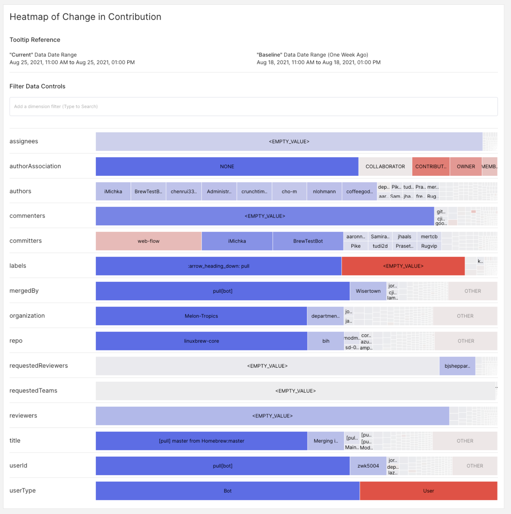
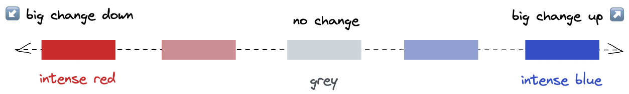
The color of the cell is determined by the change. The more important is a change, the more intense is the color.
Blue means change up. Red means change down.
The change is defined as the percentage point (pp) difference between the baseline contribution and the current contribution.
For instance: for dimension userType, in the baseline, Bot dimension represents 20% of the traffic.
In the current observations, Bot represents 50% of the traffic. This is a +30%pp change. Bot is deep blue.
Footnotes
-
Empty value 90% of time?? This is fine, the example dataset is GitHub pull requests. It just means around 90% of PRs are not assigned. ↩